KINDLE COMMUNITY
User Experience - iOS Design - Concept Project
Gone are the days of solitary reading, let’s read together.
OVERVIEW
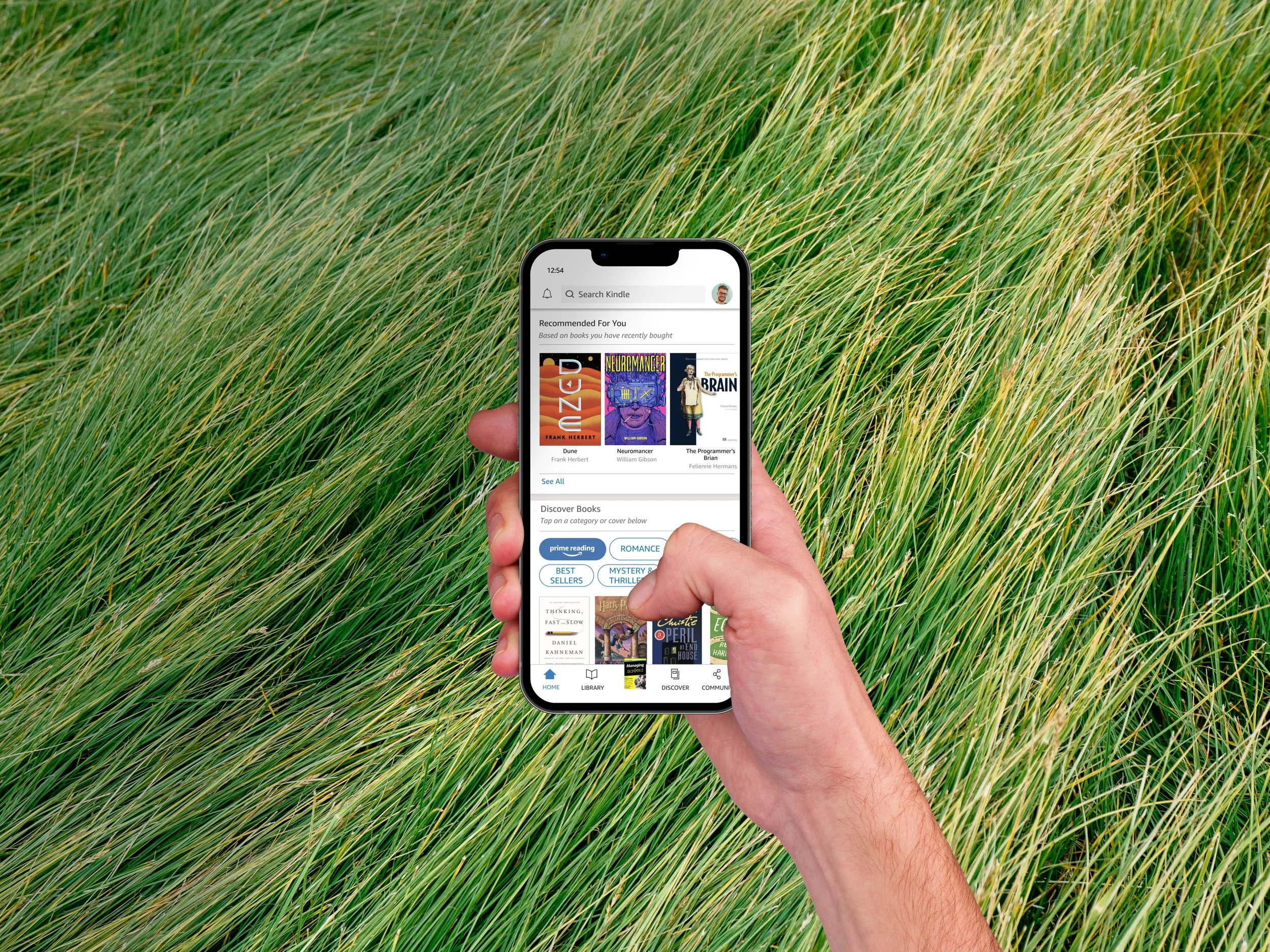
The Kindle mobile app currently serves as an extension of its e-reader device, offering over 72% of the existing market the options to read and discover new books on their phones. While it excels in this realm, my team recognized an exciting opportunity in the development of a community feature. Kindle Community, a concept project, builds on the social experience of an in-person book club in a digital space.
My role was to support research and design development while directing our team’s efforts towards an aligned vision of supporting social reading, while maintaining Kindle’s existing brand identity.
Methodologies | Survey, Interviews, Competitive Analysis, Affinity Map, Persona, Journey Map, Task Flow, Design Studio, Wireframes, Mid-fi Prototype, Usability Testing, Hi-fi Prototype
Tools | Figma, Zoom, Google Suite, Procreate
Duration | 2-week design sprint
Role | UX/UI Designer, Project Manager
SEPARATION ANXIETY
The Problem
Book clubs fell victim to the barriers produced by COVID lockdowns. With in-person meet ups no longer an option for everyone, the beloved social aspect of discussing and sharing books amongst readers in a designated space has had to adapt to the times.
Our Proposed Solution
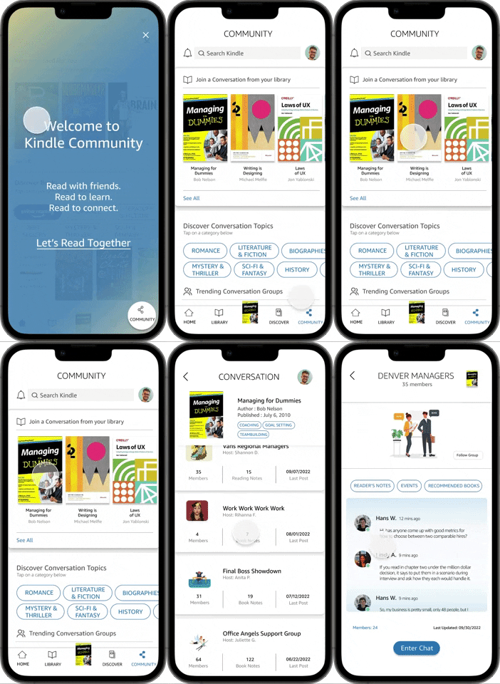
To recreate the beloved experience of in-person book clubs, we designed a community extension of the existing Kindle mobile app. In this part of the app, we allowed users to discover other readers with similar book interests, and to share and discuss reading insights via annotations and real-time chat rooms.
DISTANCE MAKES THE HEART GROW FONDER
Discovery
With a clear problem to address, we turned to users to understand their social reading habits. Our team collected 23 survey responses and conducted 5 interviews with “habitual readers” before mapping our key insights to hone in on their desired needs and values.
Surprisingly, we found that our users are intimidated at the prospect of keeping up with the rigid schedules and expectations of a traditional book club, and prefer setting their own pace and context for discussion. Despite these not-so-positive associations,
96% enjoy discussing books
92% are open to connecting socially with other readers.
A competitive analysis of book centric and social media platforms revealed the delicate balance of connecting users with other readers and offering useful tools, while also keeping features limited so the app feels supportive but unintrusive.
We discovered tools media giants use to keep their users engaged and active within their communities. Common themes emerged, including:
the ability to create and customize a group
real-time forum-style chatting to drop in to suit user’s flexible scheduling needs
community-centered events that foster engagement and bring users together
PETER SEEKS A BOOK BUDDY
Empathize
A friendly amalgamation of initial research, Peter is a typical user who is eager for the opportunity to connect and share insights with other readers.
From the process of fleshing out Peter’s background, we came to understand the potential of Kindle Community as not just a digital bookclub platform, but a self-sustaining learning space where users can ask other readers specific questions from texts as they come across them in real time.
This provides added value to the business as well as the user through opportunities to offer related book recommendations that have organically been suggested and vetted by community users.
TAKE A PAGE FROM HIS BOOK
With Peter in mind, we mapped a typical user’s prospective journey through the Kindle Community space. Predicting his future-state showed that he valued quick mobility and access to finding a relevant group, entering the chat room and sharing “reader’s notes”.
Our insights pointed out exciting opportunities to develop for our MVP, such as:
Quick search functions for optimal user efficiency, ease of use and accessibility.
Prominent chat function for real-time discussions to encourage quick connection and exchanged insights between engaged users.
“Reader’s notes” to be used as shareable annotations between readers.
SLOW AND STEADY
Iteration 1 + Usability Testing
We designed features informed by our discovery methods - user formed groups and a chat room - into our Figma mid-fi prototype and performed remote monitored usability testing with 6 users via Zoom to assess ease of use, efficiency and user assumptions of the navigational flow.
-
83% of users successfully navigated to the correct conversation group, but most were confused by a lack of consistency in icons and label names.
-
On the conversation group screen, users felt the unsubscribe button was unnecessary. They would rather preview the group’s content before committing to joining the group.
-
Users felt confused by the lack of visual hierarchy on the community page screen. They wondered why the member’s list icon had equal priority as the chat icon when they are not equal in value proposition.
ALL TOGETHER NOW
Iteration 2
The usability testing insights helped inform our next prototype iteration, where we made three main adjustments. We workshopped new label names, altered visual hierarchy of icons in the conversation group screen to highlight the chat room, and improved accessibility of the existing app.
Category labels were improved by including CTA’s for ease of discovery and direction for first time users.
Prioritization of the chat feature on the conversation group screen via improved visual hierarchy of available icons.
Overall visual accessibility was prioritized by increasing color contrast of text on background and including title and author text below book covers for screen readers to pick up.
SHARING INSIGHTS
Reflections
Over the course of the project, I learned to collaborate with my team towards a shared vision that highlights our individual strengths and points of view . I challenged myself in actively re-iterating throughout the design process, and advocating for specific user needs and accessibility while still working within Kindle’s living design system framework.
Next Steps
With more time, I’d love to further improve visual contrast aspects of our prototype, and have further usability testing performed to see if the experience of our navigational flow and information architecture has improved from our first iteration. The project would also benefit from additional personas, and perhaps a little more color in the UI to add interest and delight for the user experience.


